Introduction
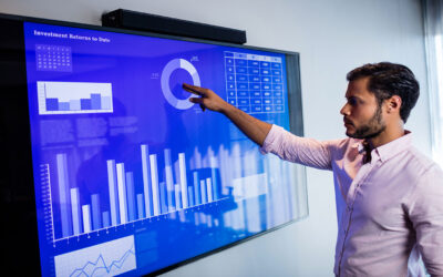
In the realm of data visualization, the landscape is constantly evolving, pushing the boundaries of creativity and functionality. While bar charts and line graphs remain staples in the visualization toolkit, innovative techniques are emerging that offer new ways to represent and interact with data. In this blog, we embark on a journey beyond traditional charts and explore cutting-edge data visualization techniques that are shaping the future of the field.
The Evolution of Data Visualization
Data visualization has come a long way since the days of static charts and graphs. Today, advancements in technology and design have enabled the development of interactive, immersive, and multi-dimensional visualizations that transform how we perceive and understand data. From dynamic heat maps and immersive 3D visualizations to animated timelines and interactive network graphs, the possibilities for innovative data visualization techniques are endless.
Dynamic Heat Maps
Heat maps are a popular visualization technique for representing density and distribution across geographical or spatial dimensions. However, traditional heat maps are static and provide a fixed view of the data. Dynamic heat maps, on the other hand, allow users to interact with the data in real-time, adjusting parameters such as time frame, density thresholds, and color gradients to explore patterns and trends dynamically. This dynamic approach to heat mapping enables deeper insights and more nuanced analysis of spatial data.
Immersive 3D Visualizations
With the rise of virtual reality (VR) and augmented reality (AR) technologies, data visualization is entering a new dimension – literally. Immersive 3D visualizations enable users to explore data in virtual environments, interacting with data points, structures, and landscapes in three-dimensional space. Whether it’s visualizing complex molecular structures, architectural designs, or geographical terrain, immersive 3D visualizations provide a richer, more immersive experience that enhances understanding and engagement.
Animated Timelines
Timelines are a powerful visualization technique for representing chronological data, such as historical events, project milestones, or trend analysis over time. Animated timelines take this concept a step further by adding motion and interactivity to the visualization. Through animated transitions, users can see how data points evolve and change over time, allowing for dynamic storytelling and exploration of temporal patterns. Animated timelines bring data to life, making historical events and trends more vivid and engaging.
Interactive Network Graphs
Network graphs are used to represent relationships and connections between entities, such as social networks, organizational structures, or supply chains. Interactive network graphs enable users to explore these connections in real-time, zooming in on specific nodes, filtering by attributes, and adjusting layout algorithms to reveal hidden patterns and insights. By allowing users to interactively explore complex networks, interactive network graphs facilitate a deeper understanding of relationships and dynamics within the data.
Streamgraphs
Streamgraphs are a unique visualization technique that represents changes in data over time through a series of stacked, flowing layers. Each layer in a streamgraph represents a different category or segment of the data, and the width of the layers varies based on the magnitude of the data values. Streamgraphs provide a visually engaging way to track changes in data distribution over time, making them particularly useful for visualizing trends in multi-dimensional datasets such as stock market fluctuations or website traffic patterns.
Parallel Coordinates
Parallel coordinates visualizations are used to explore multivariate data by representing each data point as a line that intersects multiple parallel axes, with each axis corresponding to a different variable. By plotting data points as lines and connecting them across multiple axes, parallel coordinates allow users to identify patterns and relationships between variables more easily than traditional scatter plots or histograms. Interactive features such as brushing and linking enable users to select and compare specific data subsets within the visualization, facilitating exploratory data analysis and pattern recognition.
Sankey Diagrams
Sankey diagrams are flow diagrams that visualize the flow of resources, energy, or information through a system, with the width of the flow representing the quantity or magnitude of the flow. Sankey diagrams are often used to visualize complex processes or systems, such as energy flows in a power grid, material flows in a manufacturing process, or customer journeys in a sales funnel. By visually representing the flow of resources or information, Sankey diagrams provide insights into the efficiency, distribution, and relationships within a system.
Conclusion
In conclusion, the field of data visualization is rich with innovative techniques that enable us to explore, analyze, and communicate complex data in new and compelling ways. From geospatial temporal visualization to streamgraphs, parallel coordinates, word clouds, and Sankey diagrams, each technique offers unique advantages for visualizing different types of data and uncovering valuable insights. By embracing diversity in data visualization and exploring a wide range of techniques, we can unlock new perspectives, gain deeper understanding, and drive innovation in data-driven decision-making.
Search
Categories
- AI 5
- Analytics & Data Science 17
- Blogs 8
- Brand Identity 24
- Business 11
- Chatbots 1
- CMS & LMS 23
- Development 1
- Digital Marketing 20
- Digital Signage 13
- E-commerce 7
- Education & E-Learning 3
- Enterprise solution 16
- Events 4
- Food & Grocery 1
- Internet of Things 9
- Metaverse 1
- Mobile App Development 15
- News 5
- Open Source Development 12
- SEO Search engine optimization 2
- Software 1
- Staff Augmentation 3
- Uncategorized 1
- Uncategorized 1
- Uncategorized 65
- Web Design 1
- Web Development 19
- Web Security and Performance 19
- Website Development 2
- WordPress Development 4
Recent Posts
-
Shopify Platform: Powering Scalable and Flexible E-Commerce Businesses
-
Anthropic AI Tool: A Safety-First Approach to Enterprise Artificial Intelligence
-
Enhancing Your Engagement with Rainbet VIP Programs and Rewards Strategies
-
Best No Deposit Free Spins Deals for Casual Players in April 2026
-
Risikomanagement und verantwortungsvolles Spielen bei Rainbet mit Fokus auf Sicherheit


