Introduction
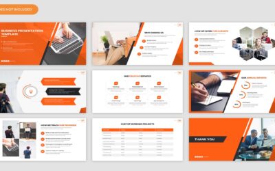
In the corporate world, presentations are a cornerstone of communication, used to convey ideas, proposals, and strategies to stakeholders, clients, and colleagues. However, simply presenting information in a bland or uninspiring manner can fail to capture the audience’s attention and convey the intended message effectively. Visual design plays a crucial role in enhancing the impact of corporate presentations, making them more engaging, memorable, and persuasive. In this blog post, we’ll explore the principles of visual design and provide tips for mastering visual design to enhance the impact of your corporate presentations.
Understand Your Audience
Before diving into visual design, it’s essential to understand your audience’s preferences, expectations, and level of expertise. Tailor your visual design choices to resonate with your audience and communicate your message effectively. Consider factors such as industry norms, cultural considerations, and the level of technical expertise of your audience members.
Simplify and Streamline
Effective visual design is all about simplicity and clarity. Avoid cluttering your slides with excessive text, graphics, or animations that can overwhelm the audience. Instead, focus on conveying your message concisely and effectively using clear and straightforward visual elements. Streamline your design by using white space, consistent fonts, and a limited color palette to create a clean and professional look.
Use Visual Hierarchy
Visual hierarchy is the arrangement of visual elements in a way that guides the audience’s attention and emphasizes important information. Utilize techniques such as size, color, contrast, and placement to create a clear visual hierarchy in your presentations. Highlight key points, headings, and call-to-action statements to draw the audience’s attention and guide them through the content.
Incorporate Visual Storytelling
Visual storytelling is a powerful technique for engaging audiences and conveying complex ideas in a compelling manner. Use visuals such as charts, graphs, diagrams, and infographics to illustrate data, trends, and relationships visually. Incorporate relevant images, icons, and illustrations that support your narrative and evoke emotions to make your presentations more memorable and impactful.
Choose High-Quality Graphics
Selecting high-quality graphics and images is essential for creating visually appealing presentations. Avoid using low-resolution or generic stock photos that can detract from the professionalism of your presentation. Invest in high-quality images, illustrations, and graphics that complement your content and enhance the overall visual appeal of your slides.
Maintain Consistency
Consistency is key to creating a cohesive and polished visual design for your corporate presentations. Establish a consistent visual style, including fonts, colors, imagery, and layout, that reflects your brand identity and reinforces your message. Use templates or style guides to ensure consistency across slides and maintain a professional and cohesive look throughout your presentation.
Practice Visual Balance
Visual balance is about distributing visual elements evenly across your slides to create a harmonious and visually pleasing composition. Balance text with images, graphics with whitespace, and colors with neutrals to create a balanced and visually appealing layout. Pay attention to alignment, spacing, and symmetry to achieve visual balance and enhance the readability and clarity of your slides.
Test and Iterate
Once you’ve designed your corporate presentation, take the time to test it with a small audience and gather feedback. Pay attention to how the audience responds to the visual design, clarity of information, and overall effectiveness of the presentation. Use feedback to iterate and refine your visual design, making adjustments as needed to improve the impact and effectiveness of your presentations.
Conclusion
Mastering visual design is essential for enhancing the impact of your corporate presentations and effectively communicating your message to your audience. By understanding your audience, simplifying and streamlining your design, using visual hierarchy, incorporating visual storytelling, choosing high-quality graphics, maintaining consistency, practicing visual balance, and testing and iterating your designs, you can create visually stunning presentations that captivate and inspire your audience. Remember, visual design is not just about aesthetics; it’s about creating meaningful and memorable experiences that leave a lasting impression on your audience.
Search
Categories
- AI 4
- Analytics & Data Science 16
- Blogs 8
- Brand Identity 23
- Business 11
- CMS & LMS 22
- Development 1
- Digital Marketing 20
- Digital Signage 13
- E-commerce 7
- Education & E-Learning 1
- Enterprise solution 16
- Events 2
- Food & Grocery 1
- Internet of Things 9
- Mobile App Development 15
- News 5
- Open Source Development 12
- SEO Search engine optimization 2
- Software 1
- Staff Augmentation 3
- Uncategorized 33
- Web Design 1
- Web Development 19
- Web Security and Performance 19
- Website Development 2
- WordPress Development 3
Recent Posts
-
Shopify Platform: Powering Scalable and Flexible E-Commerce Businesses
-
Anthropic AI Tool: A Safety-First Approach to Enterprise Artificial Intelligence
-
Explore the Exclusive Benefits of Rainbet’s VIP Program for Dedicated Players
-
Guida ai Casinò Online Considerazioni Fondamentali Prima di Iniziare a Giocare
-
Le rôle déterminant du service client dans l’expérience des joueurs de casinos en ligne


